The Artists
Original Psychedelic Rock Poster Artists Painting Their Environment
Continuing on with my previous post on original psychedelic rock poster artists, we might ponder where the inspiration for such inventive, bold, brilliant works of art would come from. Many might say from the hallucinogens that were ingested at the time. And that would be the easy answer. But, if you examine the lives of these original psychedelic rock poster artists you will find deep-seated roots in art dating back to their childhood.
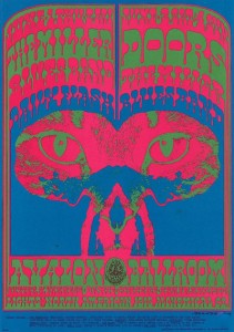
It’s not to say that the popular drugs of the day didn’t have influence in their work (the artists will tell you they did). However, drugs did not make them the brilliant artists they were (or are). You can uncover (actually in many pages of this blog) that the artists came from many backgrounds. Some cartoonists, some musicians, some with minimal accreditation and some with high honors in art instruction. With the innate talent they were born with, these original psychedelic rock poster artists were destined to be artists in one form or another.
In the 1960s it was an open playing field. The new generation wanted to rewrite almost every thing that had been the status quo. This meant not only to be an activist in art, music, literature, film and fashion–but important social and political issues of the day, as well. The germination of these new ideals would come to young minds through literature and discovering the world at large.
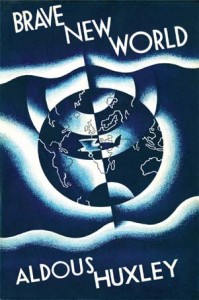 Personally, I believe books like Brave New World by Aldous Huxley were very potent. Bringing an ominous concept of a capitalist world in which people are genetically designed to be passive and useful to the ruling class. Concepts such as family, freedom, love, and culture are considered grotesque. Enough to start a fire? Considering the state of affairs of our country in the 1960s, maybe so.
After all the author was an extraordinary man who brought to his work a strong sense of the world into which he was born. There were many adorned relations in his bloodline. Including, his grandfather (Thomas Huxley) who helped Darwin realize his theory of evolution. So, even though this is a science fiction/dystopian novel, its ideals come from a credible & worldly source.
It is interesting that psychedelic art and surrealist art are similar in the fact that they both prescribe a mechanism for obtaining inspiration. One relies on the observance of dreams and the other on hallucinogens. Both tied to important developments in science, Freud’s theories of the unconscious and the discovery of LSD. The original psychedelic rock poster artists and their community were expanding their minds, their art, their freedoms and color the world unlike the stagnant black-and-white 50s. This would cause the so called Generation Gap and the youth of the country were ready to embrace it.
60s Psychedelic Poster Artists Illuminate A Decade
To explore famous rock posters in detail you may have a hard time separating them from the works of the 60s psychedelic poster artists. There are many reasons for this.
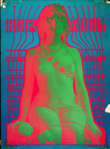
The “rock” poster was invented to advertise events both musical and social that were growing larger and larger in the San Francisco area. The seeds of the counterculture (or hippie movement) were coming of age. This movement was bound to remove itself from the ideals and rigidness of the 1950s. Creating a new culture, with its own ideals, experiences, music, fashion and sustainability.
The 60s psychedelic poster artists were very much a part of this experimentation. The three martini lunch was out! LSD and marijuana would take its place in the new counterculture. It was as much a rebellion as it was a mind expanding new frontier.
What was black-and-white in the 1950s was now bright and vibrant colors in the 1960s. The light switch had been turned on. Experimentation in all types of media would push the limits of good taste in order to be different or original. But then, bad taste could be good taste in these newfound freedoms of expression.
Whatever the case, there was much art being created around this time. Some hang in museums and some were swept away as trash. I’m speaking particularly about rock posters and handbills made usually for concerts at ballrooms and auditoriums.
The music drove the 60s psychedelic poster artists to aspire to what they did. Mostly commissioned to do concerts rock concerts, but, many would create the posters and put the shows on themselves. A good example of that would be the Pinnacle Rock Concerts that were put on in LA. (See Pinnacle Concerts posts on this site)
Although we concentrate mainly on the art, artists and famous rock posters of the 1960s–many great changes in our country were made because of the ideals and grasp for a better world from the counterculture.
Links of Interest:
Where Did Underground Cartoonist Spain Rodriguez Get His Start?
Dateline: Wedesnday November 28, 2012
Regrettably, another one of the great innovators and truly original icons of the 60s has died. Underground cartoonist Spain Rodriguez was instrumental and influential in the rise of underground comic’s.
When one reads of his childhood in Buffalo New York, you will find he (like so many of us) was engrossed with comic books. Reading, collecting, trading and trying to copy and draw all the superheroes and villains. 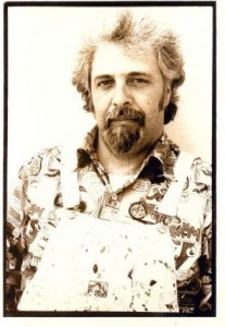
My best guess is Spain Rodriguez started his particular revolutionary comic art style when there was a censorship of comics in the late 1950s. (He was working at EC Comics for Bill Gaines at that time). I believe his anger at the establishment never left him. Illustrating tales of revolutionaries taking back the streets violently from situations of repression and corruption.
Then again, this may have started way before that. Born (Manuel Rodriguez) in Buffalo March 2, 1940, “Spain” got his name from defending his heritage in many school fights. Young Spain was a juvenile delinquent of sorts. Getting into trouble and stealing cars.
But, he had a very curious mind and was drawing comic strips from a very early age. He mentioned one time that his best art education came from working at the Western Electric Plant where he drew workers and machinery. So, we get a snapshot of the blue-collar working class background of the artist. Quoted many times and in many ways saying “I don’t know why, I just didn’t like rich people”
I believe that the most pure and best creativity comes from extreme emotions like love, hate, anger,fear and envy. As an underground cartoonist Spain Rodriguez exorcised these feelings into a new bold, bombastic and cataclysmic art form the underground comix.
After working for Bill Gaines (Mad Magazine) it didn’t hurt to have friends like underground artist Art Spiegelman and rock stars like Jerry Garcia to help his career. He would be included in the innovator’s and wave of artists like R. Crumb, S.Clay Wilson and Bill Griffith who established the irreverent, profane, highly sexed, antiwar, anti-capitalists spirit. Things very dear to underground cartoonist Spain Rodriguez. We salute you and miss you, sir.
Relevant links:
How did the Griffin Moscoso Collaborations come about?
There were many Griffin Moscoso collaborations. Victor Moscoso ran into Rick Griffin for the first time in the Spring of 1967. He saw what looked like “Jesus Christ with a portfolio in his lap” at The Family Dog offices where he was picking up a check that day. Their first meeting was magical.
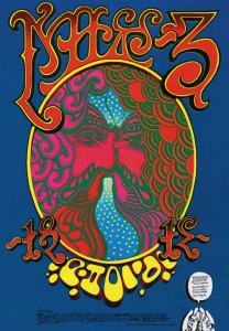
Griffin had come over to Moscoso’s house with a layout of lettering around an oval shape. he needed collaboration on what would go inside the oval and how to finish the piece. Moscoso traced and used Griffins face in the oval shape, but his features are made of butterflies, peacocks and stars.
Interesting footnote here: Rick Griffin’s lettering on this poster was a gag. It says absolutely nothing! Most poster art lettering was intentionally made hard to read (thru creative graphic effects) in order to keep the viewers attention. This was a main stay of Griffin Moscoso collaborations as well as other psychedelic poster artists. You know, the harder to read…the better! So, as a spoof Griffin did the poster you could never read – because there was nothing to read! That was the poster for a Chuck Berry Concert at The Fillmore West Ballroom
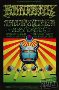
According to Moscoso, he and Rick Griffin worked on six posters together and they were all good. (I do not doubt that with the caliber of talent here). They would do them all at the same time and the same place. Many Griffin Moscoso collaborations would consist of what they called “jams”. This was taken from “jam sessions” where musicians trade licks with other musicians. This seems to have been a very rewarding and fun partnership. “Neither Rick nor I ever did anything that we didn’t want to do” – VM.
They often would be able to solve each others problems. Working with complicated graphic processes with the printer (at least to this author), one of them would come up with something perfect to complete the others creation. “Not only is it a perfect solution, but it’s a surprise, because it’s coming from another mind.” says Moscoso.
I say it again, the Griffin Moscoso collaborations were phenominal. they carried this union on into their work at Zap Comix. But, I want to explore some of the creative process on their individual posters and also their work at Zap Comix…maybe in another post on underground cartoonist R. Crumb.
When Did Moscosos Comic Books Begin?
When Did Moscosos Comic Books Begin?
With our theme on psychedelic artistes, it is noteworthy that Victor Moscoso’s (famous rock posters artist) streetwise upbringing in Brooklyn gave him a no-nonsense type of approach to art and art projects. He takes a very practical view of commissioned assignments and personal projects. Lucky for us! I believe this led to many projects and encompassed a wide range of work he may have not discovered. This may include (but not limited to) his work and leadership at Zap Comix and other Moscosos comic books.
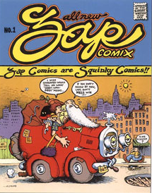
This image to the left is the very first Zap Comix Book. Launch date was March 1968 and the brain child of legendary underground comics artist Robert Crumb (R.Crumb). Crumb would recruit other artists S. Clay Wilson, Robert Williams, “Spain” Rodriguez, Gilbert Shelton, Victor Moscoso and Rick Griffin to collaborate with him. The latter two with reputations as psychedelic poster designers, in their own right. They would all come on board as the new roster of artists for Zap Comix.
Moscoso and Griffin worked well as partners on many poster designs and projects. Griffin had actually made his bones doing a surfer comic strip “Murphy” in 1961 and started germinating the idea of doing comics with Moscoso, before Zap was published.
It is claimed that the term “comiX” (with an X) refers to the traditional comic book style of Zap, and its mixture of dirty jokes and story-lines. Moscosos comic books (Zap Comix included), were more of an an illusory / optical type of art. But, “Crumb and Griffin took the taboos straight on” as Moscoso puts it. The comic books were labeled “Fair Warning: For Adult Intellectuals Only”. This was soon to be taken very literally, as this obviously was not a kiddies comic book. So bad, that in some places you could not buy this over the counter. This made the comic even more coveted and wildly popular.
Zap#4 was most infamous as it depicted an R. Crumb story “Joe Blow”. It was about a incestuous All-American nuclear family . Their motto being “the family that lays together stays together”. Numerous “community standards” obscenity busts and court cases were brought against the publisher Print Mint. This was actually was banned in New York from over the counter sales.
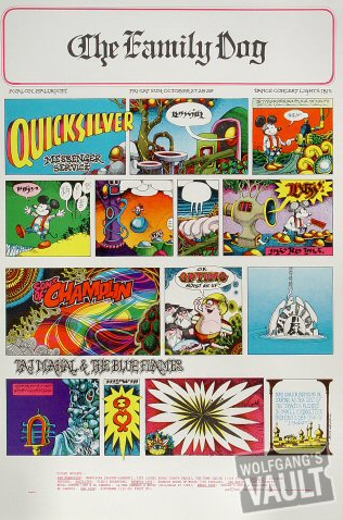
According to Moscoso – R. Crumb had been a super fan of he and Rick Griffin and after seeing poster Family Dog #89 an imitation of the Sunday Chronicle pages. After seeing that he went home and created Zap Comix. They were in essence his heros.
That is actually a very interesting time line and important info. All of these guys were so famous, many times you dont know who came first. But, to answer the question to our post – When Did Moscosos Comic Books Begin? I would have to say not in the FIRST issue of Zap Comix. But, as we revealed earlier, obviusly a Moscoso/Griffin poster was the inspiration. It would probably be the second issue moving forward to this day. Moscoso was heavily involved in the comic even in distribution and management. He was instrumental (IMHO) in making Zap Comix the phenomenon that it is.
Who is Rock Concert Artist Victor Moscoso?
Rock Concert Artist
Does that title bring to mind a guy with formal academic training @ Cooper Union, NY – Yale – SF Art Institute and taught there as well? Meet rock concert artist Victor Moscoso. We’ll wax endearingly about all of the classic -golden era rock concert poster artists (Wes Wilson, Stanley “Mouse”, Alton Kelley, Rick Griffin and more) but, Moscoso was the exception to the rule.
It does not come down to a matter of style or who’s the better artist or possibly who had more experience – that is all relative to the viewers style and taste. We are talking strictly about formal education in art. Now, this was a good thing and a bad thing as it turned out. According to him -the structure and rules of his formal art education had to be torn down and rewired in order to experience the freedom he needed to excel in poster art. Wow! Artist sacrifices for his art, yet again.
This is amazing to me. I have been an admirer of cartoonist, artist, teacher and rock concert artist Victor Moscoso for many, many, years. Now, to discover the struggle and reversing of academic knowledge just to do rock concert posters…sounds pretty incredible now. But really, it goes perfect with the 1960s mentality. Being experimental, being free, and liberating (I think were his words) were the direction & expression of art, music, and the counter culture itself. I’ll give you a couple of quotes here that I feel are relevant and capture the essence of this era and comment on fine art vs. commercial art.
“The 1960s were where fine art and commercial art met. It was a great time, it meant breaking all the rules” – Stanley Mouse
“It’s all commercial: The Sistine Chapel is a commercial illustration for the Catholic Church.” – Victor Moscoso
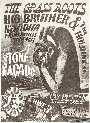
According to my research – he began the poster art as a resident of Haight Street (of the legendary “Hippie” Haight-Ashbury intersection) somewhere in 1966. He said “It was cheap and the neighbor hood just kinda sprang up-we had no idea we were “cutting edge” at the time. From this quote I get the feeling that Mr. Moscoso was one first to make it on the scene and producing rock concert posters for Chet Helms and Avalon Ballroom
…
(We will actually get into the origin and evolvement of psychedelic poster art in another post)
Growing up in Brooklyn comes with street smarts and Victor was no exception to the rule. After much training and school…”On The Road” – Jack Kerouac was published in 1959 he was compelled to move west to California.
Well that is a brief introduction to our featured rock concert artist Victor Moscoso. Next up: more about his history, artistic heritage, accolades and what made his rock posters stand out from the rest.
Why Rare Victor Moscoso Poster Art is Priceless
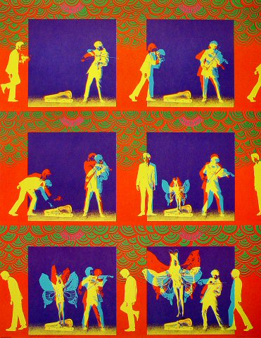
Why is rare Victor Moscoso poster art priceless to me? I’m trying to examine that in this post. Just perfect art in my opinion. What is it? Why does this attract me so much? Could it be he is a Spanish artist? It might be-who knows.
Some of my first formal training or awareness of classic art was exposure to early Spanish artists. I could do without Monet or Van Gogh or Renoir – (although greatly admired) did not float my boat.
What did …were the men from Spain – Goya, Greco, Picasso, Dali. To me the art was just unfathomable and extraordinary to unbelievable heights. What minds, What imagination. The lineage of great art does not stop in the 19th century; which is apparent in rare Victor Moscoso poster art – painting and other multi-media. Maybe it is the bold strokes and exquisite choice of color inherent to the works of these Spaniards.
Ga Ga for Goya! (30 March 1746–16 April 1828) he lived to be 82 years young, way beyond what most men lived in the 19th century. (Which was about 47 years old). Greco died at 73 – he being in the 17th century. Victor Moscosco is 76 years old now.
Who is Victor Moscoso? well, you’re on the Famous Rock Posters web site – so you should have a clue. He was best known for psychedelic rock posters/advertisements and underground comix in San Francisco during the 1960s and 1970s. Also, Moscoso was one of the first rock concert poster artists of the 1960s era with formal academic training @ Cooper Union, NY – Yale – SF Art Institute and taught there as well.
Sidebar: Josef Albers (March 19, 1888 – March 25, 1976) was Moscoso’s instructor at Yale. He came from (most influential) The Bauhaus school of Germany. To escape the Nazi pressure he emigrated to the USA and landed @ the Black Mountain College, N.C. which is near my hometown. More on that in another post. He is best remembered as abstract painter and “Homage to the Square” series and as theorist.
Ok, back to Victor. I would say his first big break was designing posters for the concerts & new music scene in the dance halls and auditorium’s in SF. It culminated to international attention in the late 60’s. Next would be underground comics ,album covers, billboards and multi-media. He went on to win two Clio awards in advertising and design.
Images of rare Victor Moscoso poster art are found easily on the net. But the actual posters you seek could be more difficult to find. If your interested here is a nice place to start with a small-medium-or big budget (super collectables)
The Victor Moscoso Collection
If anything, view nice – clear- large images of these beautiful works and see for yourself why rare Victor Moscoso poster art is priceless and why I am such a huge fan of this magnificent artist!
Rose Bowl Rock Poster
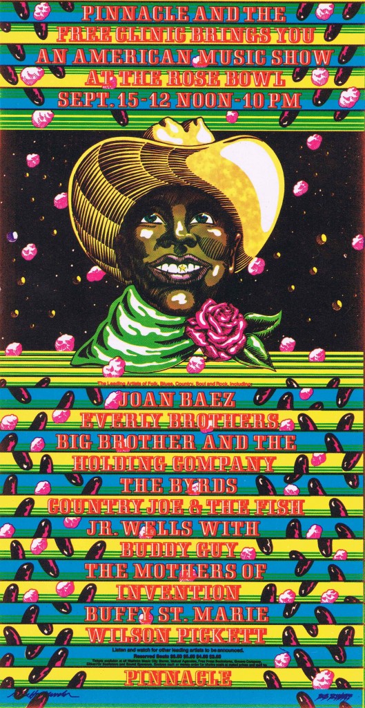
Well, the latest news on this Rose Bowl Rock Poster is the seller decided to take one auction it off on Ebay. it sold and made a pretty good return at $52.66 I believe. If you remember this particular seller bought 30 of these American Music Show Handbills at an estate sale recently. He had sent me some images and info (as much as he could) on the piece to see if I could could come up with an appraised value.
If you look at many of these Rose Bowl Rock Poster designs – whether it is full posters, handbills, or post cards (which were the printed pieces of choice to promote the concerts) you get a certain feel for the value. Handbills (unless very rare) are usually in the $50.00 range. This is a beautiful 8 X 4 mint condition card by artists VanHamersveld and Schnef and a very nice affordable collectors piece.
If you are interested in purchasing one of these you can keep an eye out on Ebay as they will possibly be showing up time to time. Or you may shoot us an email and I can put you in direct contact with the seller.
You know there are many stories that go along with that handbill and that particular 1968 American Music Show @ The Rose Bowl. One I’ll share now…Sam Andrew (Guirartist Big Brother & The Holding Co.) quotes:
“We hopped in a limousine after the gig, and the fans piled on top. I was afraid we would be crushed.”
15 September 1968 Rose Bowl Pasadena
This was an interesting quote, because I just read in “The West of Center: Art and The Counter Culture Experiment in America, 1965-1977” that this Rose Bowl concert was not well attended. As a result Pinnacle (Three partners known as Pinacle Rock Conerts) failed financially and the Shrine Concerts ended.
Many of the Pinnacle Shows were at the Shrine Auditorium. Also, John Van Hamersveld (one of the artists on this piece) was in fact one of the founding partners in Pinnacle Rock Concerts.
This Rose Bowl Rock Poster was co-designed by Bob Schnepf and John Van Hamersfeld.
Famous Rose Bowl Rock Poster
Just a follow up to the famous rose bowl rock poster that was sent to us for an appraisal. It occurred to me that you may not have been able to appreciate this at the image size I had posted it earlier. So, here it is in all its glory!
Well, i did receive some more information on this art work and the artists. The artists of this famous rose bowl rock poster are VanHamersveld and Schnef. The year (1968) and that it’s in the Art of Rock Series #3.71 for those following closely – this ACTUALLY is a handbill / postcard not the full poster. The full poster looks to be in the neighbor hood of around $1,200.00 (mint condition)
Handbills are not as valuable as a rule of thumb. But, there is a Dave Clark Five at the Melodyland Theater handbill I saw recently that was worth $1,575.00.
Wow! thats a rare piece – you can see it here:
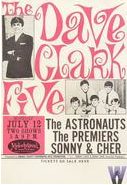 The Dave Clark Five Handbill
Many nice selection of handbills, postcards, posters and much rock and roll memorabilia to peruse there, as well.
Anyway, back to our American Music Show poster. After further investigation these artists (it must have been a collaboration) John Van Hamersveld and Bob Schneph both have a body of work in the psychedelic concert poster design category and no telling what else.
I will be doing even MORE R&D on these guys and this famous Rose Bowl rock poster…for I still do not have a value I can come back to the seller with. They own 30 of these from an estate sale and are willing to let them go – but for what price? More to follow for sure on our “mysterious” new psychedelic artifact. Garsh, I would really like to talk to some one who was at this famous rose bowl rock concert…it looks like a whopper. If your old enough to recognize the acts on this bill then YOU KNOW it was around 1968 when it took place.
over & out, for now.
Concert Poster Design
Concert poster design certainly did not originate in the 1960’s. But , I would say that between the years 1955-1971 were the golden years of famous rock concert posters. Early on (if your old enough to remember) posters for events such as wrestling, boxing and musical events were very mundane and predictable. They were usually just a 2 color printing job and plastered on telephone poles near stop lights. 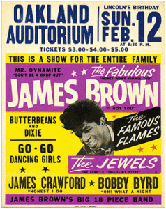 For the times, this type of concert poster design was exciting and caught your eye. Very bold and you got the message quick.
However, if you compare the posters of music, sports, and other events of the time…they all had a similar formula. Also, they were cheap to produce. Therefore you could print in high quantity to get the message out. Most of them had this same look and feel as the James Brown poster featured here.
I have a sentimental feeling for these type of posters (from a graphics artist /historical viewpoint). But, when you realize the multitude of posters produced with the same elements it was over kill and kind of boring after a while. These type of 2-3 color events posters were produced mainly in the 1950’s. Concert poster design would get turned on it’s ear during the next decade. No more restrictions on color – no more stamped out clones of posters. There will be a revolution of art and music coming in the 60’s.
The type of original music created (mainly to compete with the British Invasion, a la “The Beatles”) would bring a new creative and colorful posters to represent it. Also, notable artists, cartoonists and graphics people were on board for this art explosion. Speaking of which, i just had a nice hand bill sent to me for apprasial.

Wow, it is nice. I cant say that ive ever seen this particular piece for “An American Music Show At The Rose Bowl” I can tell you it must have been some event in 1968 with the muscial line up that was presented. Joan Baez, The Byrds, Big Brother & The Holding Co. – the list goes on and on.
This looks to be from an underground cartoonist to me. But, I cant place it. Anyone have a clue? If you have any info on this postcard/handbill or this event send me something back on it. I am currently doing some research on this concert poster design and would welcome some advice info or help.
Keep On Truckin’ !!